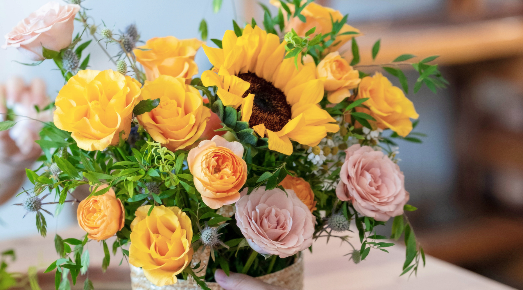
🌈 Transform Your Floral Designs with These 10 Color Tips
Color isn’t just decoration—it’s a language. In floral design, colors express emotions, evoke memories, and create moods. Whether you're creating a bouquet for a loved one or styling flowers for an event, understanding how to use color well can completely transform your design.
At Floristy15, we believe flowers speak not only through their petals but also through their palettes. Let’s dive into 10 easy but powerful color tips to elevate your next floral creation.
🌸 1. Start with Emotion
Before choosing flowers, ask: What do I want this bouquet to say?
-
Warm tones (red, orange, yellow) = passion, joy, energy
-
Cool tones (blue, lavender, green) = peace, comfort, calm
-
Neutrals (white, beige, blush) = purity, simplicity, grace
🌿 2. Pick a Primary Color
Choose one strong base color as your starting point—this sets the tone and keeps your palette focused. Build supporting tones around it for balance.
🎨 3. Learn Basic Color Theory
-
Monochromatic: One color, many shades = elegant & clean
-
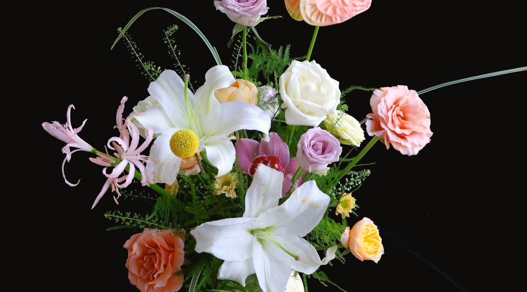
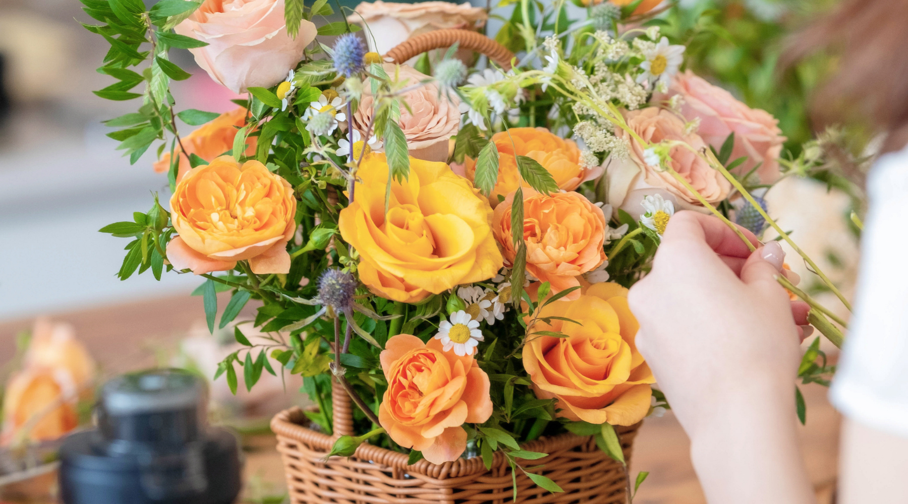
Analogous: Neighboring colors (e.g. peach, pink, coral) = soft & harmonious
-
Complementary: Opposites (e.g. purple & yellow) = bold & eye-catching
-
Triadic: Three evenly spaced hues (e.g. red, yellow, blue) = dynamic & playful
🌼 4. Work with Seasonal Colors
Each season brings its own color stories:
-
Spring: pastels, soft pinks, mint greens
-
Summer: bright oranges, yellows, fuchsia
-
Autumn: burnt orange, burgundy, deep plum
-
Winter: icy blues, white, forest green, crimson
💡 5. Don’t Overcrowd Your Palette
Stick to 2–4 main colors. Too many competing tones can make the bouquet feel chaotic instead of cohesive.
🌾 6. Use Greenery Wisely
Green isn't just filler—it’s the frame. Olive, eucalyptus, and ruscus add contrast, movement, and depth to your color palette.
💖 7. Think About the Occasion
Let the event guide your palette:
-
Weddings: romantic, soft tones like blush and ivory
-
Birthdays: vibrant, fun colors
-
Sympathy: calming neutrals or muted cool tones
-
Corporate: modern, chic neutrals with pops of bold color
🌹 8. Let Texture Complement Color
Color isn't everything—texture adds life. Use feathery fillers, soft petals, or structural stems to support your palette visually and emotionally.
🖼️ 9. Be Inspired by Art, Fashion, Nature
Take color inspiration from things you love—a painting, your wardrobe, or even the sky at sunset. Snap photos of pleasing palettes in your daily life.
🧪 10. Try Something Unexpected
Don’t be afraid to experiment. A pop of cobalt blue in a pastel bouquet? A shock of chartreuse in soft neutrals? Sometimes, one surprise color creates the magic.
🌷 Final Thoughts
A well-chosen color palette turns a bunch of flowers into a story. Whether you’re designing for someone else or simply arranging blooms to brighten your space, let color be your guide.
At Floristy15, we combine artistry and emotional storytelling—one hue at a time. Want help building your own perfect palette? Come visit us in-store or DM us with your vision.
Leave a comment
This site is protected by hCaptcha and the hCaptcha Privacy Policy and Terms of Service apply.